https://dsl.richmond.edu/panorama/redlining/#loc=5/39.1/-94.58
Reviewed by Carli V. Lowe, San José State University [PDF Full Text]
Mapping Inequality is a digital humanities project that allows users to explore the history of redlining in the United States through an aggregation of records from the National Archives and Records Administration (NARA). It uses the Home Owners’ Loan Corporation’s records, dating between 1935 and 1940, to create an interactive map that reveals the ways city neighborhoods were rated according to their perceived desirability and risk levels for granting home loans. The site allows users to explore this information in different forms including the original digitized records, full transcriptions of the records, and excerpts that highlight significant details selected from the records by the project designers. The goal of Mapping Inequality is to call attention to the ways in which the practice of redlining contributed to the ongoing reality of racial inequality in the United States. Transcription is ongoing, and more information will be available on the site over time.
This project was created at the University of Richmond by a team under the leadership of Dr. Robert K. Nelson, Director of the Digital Scholarship Lab. He developed and co-designed the application, as well as contributing to the text. With a background in English and American Literature, Nelson’s work on this project and others reveals his interest in using digital tools to reveal patterns waiting to be discovered in historic documents.[1]
There were many others who contributed to this project, including Justin Madron who managed the data and metadata, Nathaniel Ayers who codesigned the map, and a team of other faculty and students too numerous to list in this short review. Their names and contributions are described on the site.[2] It is important to recognize the amount of labor, dedication, and collaboration it takes to create a project of this scale.
The design of the Mapping Inequality site and the information it provides are both aesthetically pleasing and intuitive. It invites engaged exploration through beautiful graphics and an easily navigable interface. The homepage displays a map of the United States that allows you to zoom in on different cities across the county. The text on this page is limited to the names of the cities and a key that briefly explains the color-coded circles that appear next to each city’s name. This immediately piqued my curiosity and prompted me to zoom in on the map to learn more. Each interaction with the page reveals another layer of information to investigate.
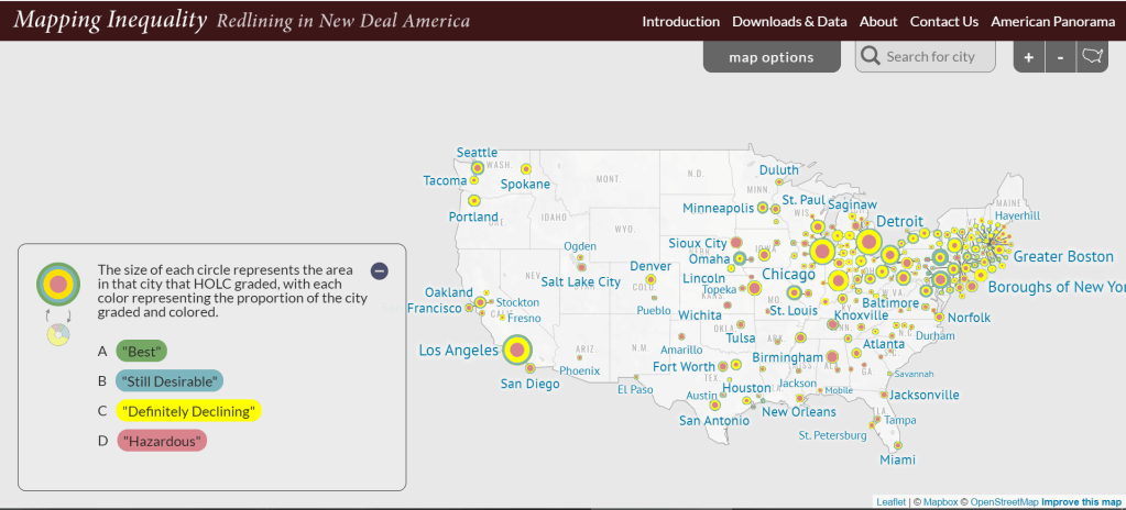
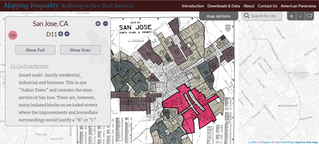
I recently moved to a new city and I became quickly entranced by the unique ways I could explore the history of my new home. Zooming in on one city, in my case San José, changed the view to a map of the city’s districts, color-coded according to how the Home Owners’ Loan Corporation rated them. This changes the information in the key to include the city’s historical demographics and summaries of comments on each district. From there, either in the map or in the text, I was able to select one district, revealing access to excerpts from the record, from which I could also click on options to view a full transcription or the digitized record itself.

The “Downloads & Data” section of this site allows users to see the distinct layers of data and documents that are the building blocks of the project. It provides downloads of spatial data in Shapefile or GeoJSON formats, and allows users to locate the data by the name of a state or city. It also shows the original unaltered scans of the archival documents on which the project is built. This adds a level of transparency to this project. Not only can the information be gleaned and repurposed from this site, but users can also see how the information was obtained and curated, and then remove those layers of curation to see the digitized records and raw data with their own eyes.
This project is an inspiring example of the simplicity and complexity that can coexist in a digital humanities project. Its design is simple and straightforward. It is simply a map that the user can zoom in on and click around. But the information it provides is complex in that the history and ongoing impact of the information it contains demands critical thinking and may also evoke emotional reactions. There is a great deal to learn from the site itself, but the information could also become a piece of a larger research project.
One drawback of the site’s design is the order in which information is introduced to the user. The homepage shows the map, and if a user is immediately drawn to interact with the map—as I was—they may initially miss the “Introduction” tab that provides context for the project, describing its goals and why the history of redlining is significant. Without this context, someone who is exploring the site without any background knowledge of redlining may be confused. Even once on the Introduction page, a user must read a large amount of text before finding the paragraph that defines redlining and provides the goal of the project. On the one hand, this could mean losing an audience of people who could otherwise use this site to learn about the history of redlining in the US, especially if they come across the racialized language in some of the records before understanding the context. On the other hand, the design invites a user to explore first, and exploring the interactive map can generate questions which prompts more exploration and may later be answered by reading the Introduction.
I appreciate that the majority of the site allows the data to speak for itself and encourages the user to build their own understandings. It is also clear that the creators made intentional decisions positioned from a particular perspective. While the archival records are made available through the site, the excerpted versions highlight the information that supports the overall claim the website is making: that decisions about the risks of mortgage lending in one neighborhood versus another were often rooted in perceptions about the racial and ethnic make-up of the area. These records reveal the history of systemic economic exclusion based on race and ethnicity. Mapping Inequality makes this information available and provides one lens through which to view it.
Mapping Inequality is useful for archivists thinking about different approaches to sharing materials in archives. The digital tools used here enhance the users’ interactions with and understanding of these materials beyond the experience of reading through a box of records on their own. For archival researchers, this project makes a large and important body of data, critical to understanding the history of the United States, freely accessible and easily navigable.
[1] “Faculty & Staff,” American Studies Program, University of Richmond, accessed October 14, 2020, https://americanstudies.richmond.edu/faculty/rnelson2/.
[2] “About Mapping Inequality,” Mapping Inequality, accessed October 14, 2020, https://dsl.richmond.edu/panorama/redlining/#loc=13/37.313/-121.927&city=san-jose-ca&area=D7&text=about.

I had the opportunity to serve on this project for about 2.5 years at both Virginia Tech and the University of Maryland and learned so much from the experience.
LikeLike